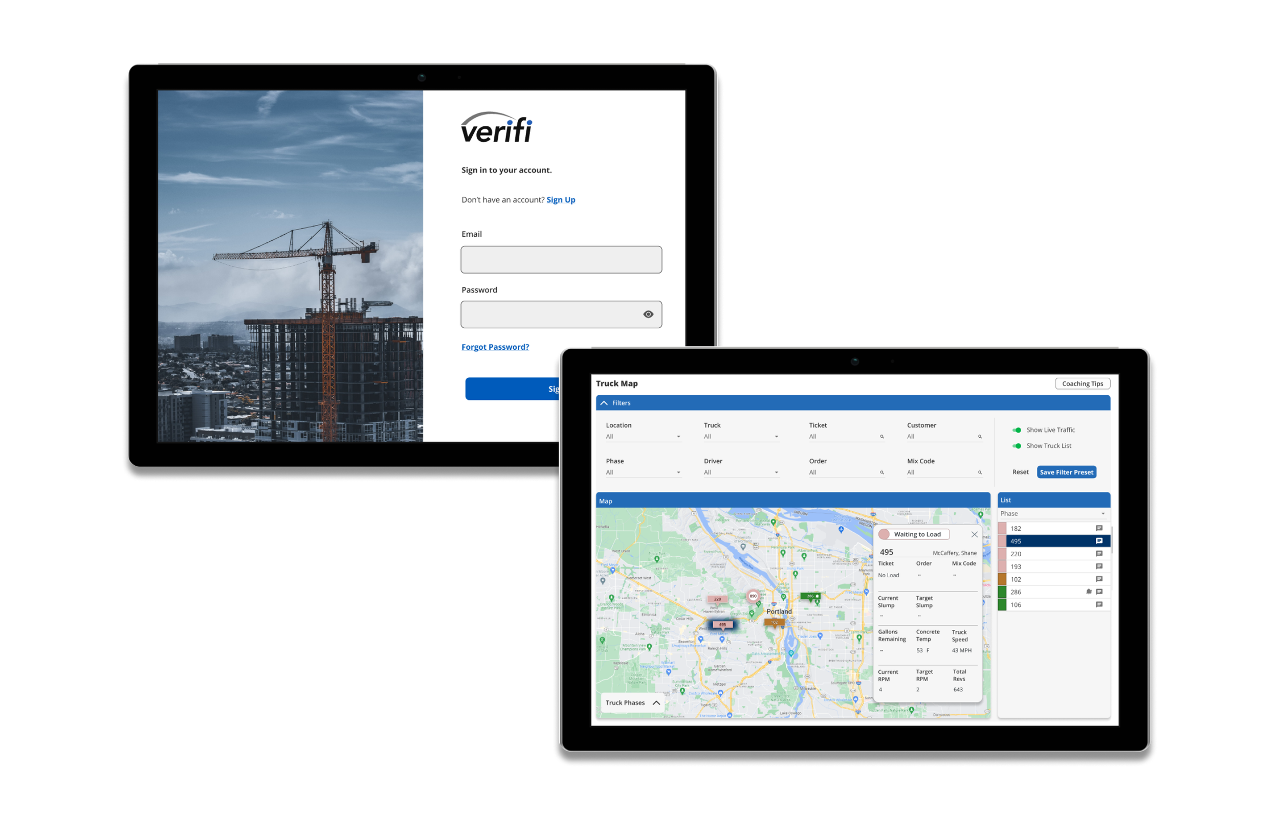
VERIFI Web Portal Redesign
Summary: The VERIFI web portal, that is used at dispatch, command center, and the concrete plants, was in need of a redesign.
Roles and responsibilities: UX Research and UX/UI Design
Problem: The original green portal was in need of a redesign. the usability of it was counter intuitive and the coloring was off-brand.
Solution: The portal got a complete makeover for better usability and style.
Early Development:
The early VERIFI portal had been around since 2015 and was a little outdated. The design of the green portal was unappealing, confusing, and inconsistent. When new features were added, there weren’t any updates to the rest of the portal, so you had some pages looking more new and modern than others. Not to mention, the green portal was off-brand from VERIFI, which has blue as its main color.
Competitive Analysis:
Before starting the redesign of the green VERIFI portal, I decided to take a look at what our competitors were doing with their platforms. I found lots of consistencies with our own portal in terms of functionality, so I kept most of the features the same. One feature I did like from our competitor was the ability to replay the truck route in real time, so I made sure to include that in the new design.
The portal on the left was a recent addition to the VERIFI portal. It was a completely blue truck map that was thrown into an entirely green portal with lots of robust features. My redesign on the right contains all of the same functionality as the left, but is displayed in a much cleaner and simple way.
Next is the load reports page. This was an important page because it was one of the most visited by users and also gave us the most information about the load of concrete. In the blue redesign I also included a load details page. When you clicked on the individual load it would bring you to the details page where you can get a plethora of other information, as well as, graphs, timelines, and instructions.
Prototyping:
After I did a redesign of all the pages, I had to throw it into a prototype to present to my team members and other stakeholders. This was a tedious process that included a gigantic amount of interaction design and animations. The final product was a complete clickable prototype complete with, hover states, expandable menus, pop-ups, modals, etc.
Translating to mobile:
Normally I would approach this with a mobile first mindset. However, the VERIFI portal was mainly used on desktops and tablets. It is very rare for them to be used on their mobile device, so I started with desktop and tablet design first. This ended up being a huge faux paw on my part because it was very difficult to get such a robust platform into a mobile device.
Conclusion:
Doing a complete redesign of the portal, especially without the amount of user research I would prefer, was very difficult. Unfortunately this project had gotten shelved before it could be implemented.


