Shiloh Restaurants.
Summary: Communication between users and restaurants has always been lacking. Especially with the hit of the COVID-19 pandemic, this communication and UI interaction became more important than ever before.
Roles and responsibilities: UX Research and UX/UI Design
Problem: How could we improve communication with restaurants and users while creating a seamless and intuitive interface to help along their restaurant journey?
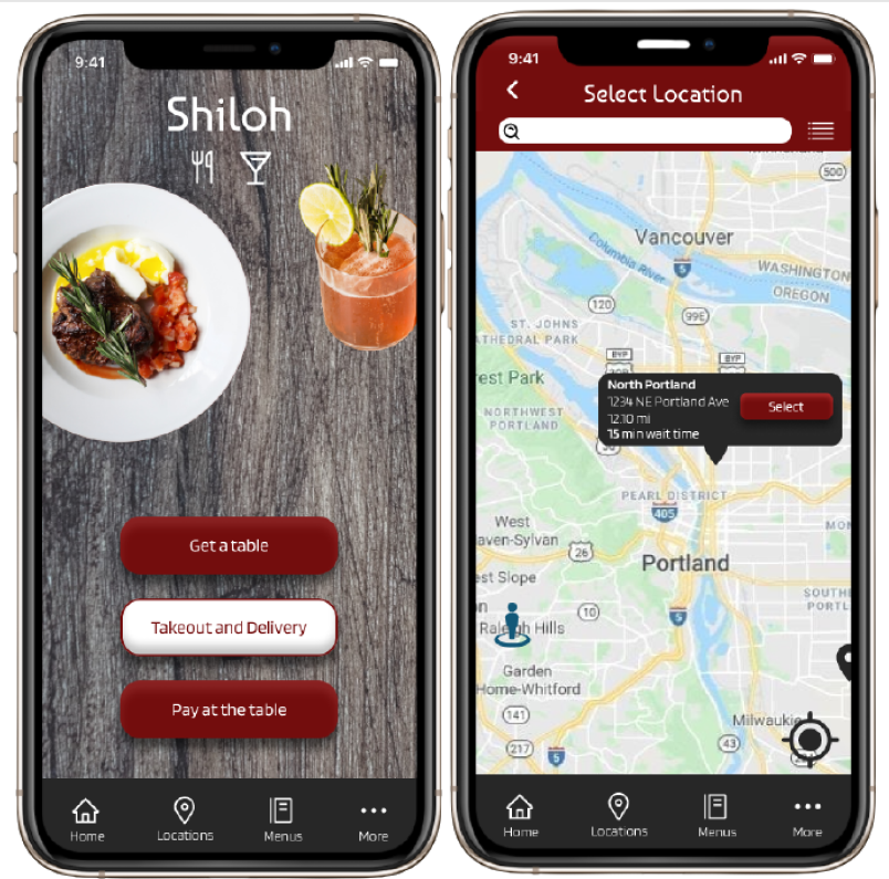
Solution: This was solved with Shiloh. Shiloh is an intuitive and easy to use app that covers every aspect of a users journey through a restaurant. From finding a location and reserving your table, to ordering delivery and even paying your bill at the table through the app.
Competitive analysis:
When doing my S.W.O.T. analysis I was able to see what the biggest chains were doing with their apps. What worked the most here were features that streamlined the users restaurant journey such as, reserving tables, finding locations, and paying at the table. What wasn’t working were the multiple links taking me out of apps, too many interface options, and similar functions displayed in different sections of the app.
Survey:
I was thinking of having the entire experience be through the users phone. However, what came up in research is users still want some human interaction. They want to order their food through a person, but when it came to paying, users didn’t want to wait on a person to pay and leave.
Personas:
Based on my research I was able to develop two user personas, Ollie and Allie. Ollie is an extrovert and Allie is an introvert. Ollie will usually be going from one spot to the next with his group of friends and will need to know about wait times and be able to pay his bill in a timely manner to make it to the next spot. Allie will probably be ordering takeout and needs the easiest route possible to order her food and take it home.
User flows:
I created the above user flows to help satisfy the needs of my two different personas. The first flow demonstrates the fluid motion of being able to pay your bill at the table so Ollie could quickly move to the next location with his group. This consists of quickly scanning a QR code to view your bill, then selecting your preferred payment type to close out
The second flow shows how easily a user could order their food for delivery or takeout. The primary delivery option goes through doordash and ordering pick-up would make the user call the restaurant for the order. In my surveys and interviews I was able to determine that most people’s preferred methods for takeout and delivery were through doordash or just calling. So as not to overcrowd the interface I kept these two options fairly simple.
Sketches:
I began doing my basic sketches of how I wanted some of the pages to look. These rudimentary drawings were a way to get my ideas down on paper and to have a solid reference for how the pages should generally look. Some stayed consistent while others were changed drastically such as, the menu for ordering, selecting payment methods, and the order method pages.
Wireframes:
During the wireframing stage I was able to neatly layout a general idea of the Shiloh’s UI and create a better sense of how the app should behave. I am particularly proud of the reservation system. I decided to do a calendar view with unavailable dates greyed out so users don’t waste time cycling through trying to find an opening.
User testing:
After user testing there were some minimal changes. The first change was in the select location page, deleting the location icons and adding a map view. The multiple location icons confused the testers because tapping the name had the same function. Adding the map view helped testers get a visual of where the restaurant is located and some preferred this option. Other than these small tweaks, testing passed with flying colors. Some jokes were even made as to how quickly the testers were able to finish their tasks. Some of the tasks included were, Sign up, make a reservation, get wait times, order delivery, and pay your bill.
Conclusion:
Next steps:
Going forward I think it would be beneficial to expand more on the pick-up or takeout orders. Certain constraints prevented me from really diving into this feature and I would really like to give users the option to call in their order and send a digital order through the app.
Final thoughts:
This was a huge passion project for me. Most of my working experience before UX was in restaurants. This was a topic I knew a lot about and had a passion for. As somebody who was directly affected by the COVID-19 pandemic while working in a restaurant it felt really good to get my ideas out there and create a solid solution.


